Complete both scorecards to calculate your growth score.
—Overall growth scoreupdated

Complete both scorecards to calculate your growth score.
Your landing page’s weakest score is Trust.
How AgentCat ranks
Proof that the product is real, competent, and safe to try.
| Trust read | |
|---|---|
| AgentCat | "Trusted by the fastest-growing AI companies" logo bar with Webflow, Cortex, MarcoPolo, Rootly, and jsDelivr |
| 'a WSO2 company' badge with acquisition banner | |
| No visible trust signal identified. |
The phone experience as a first-class citizen.
 1234
1234Does the design help or inhibit what the page is trying to say?
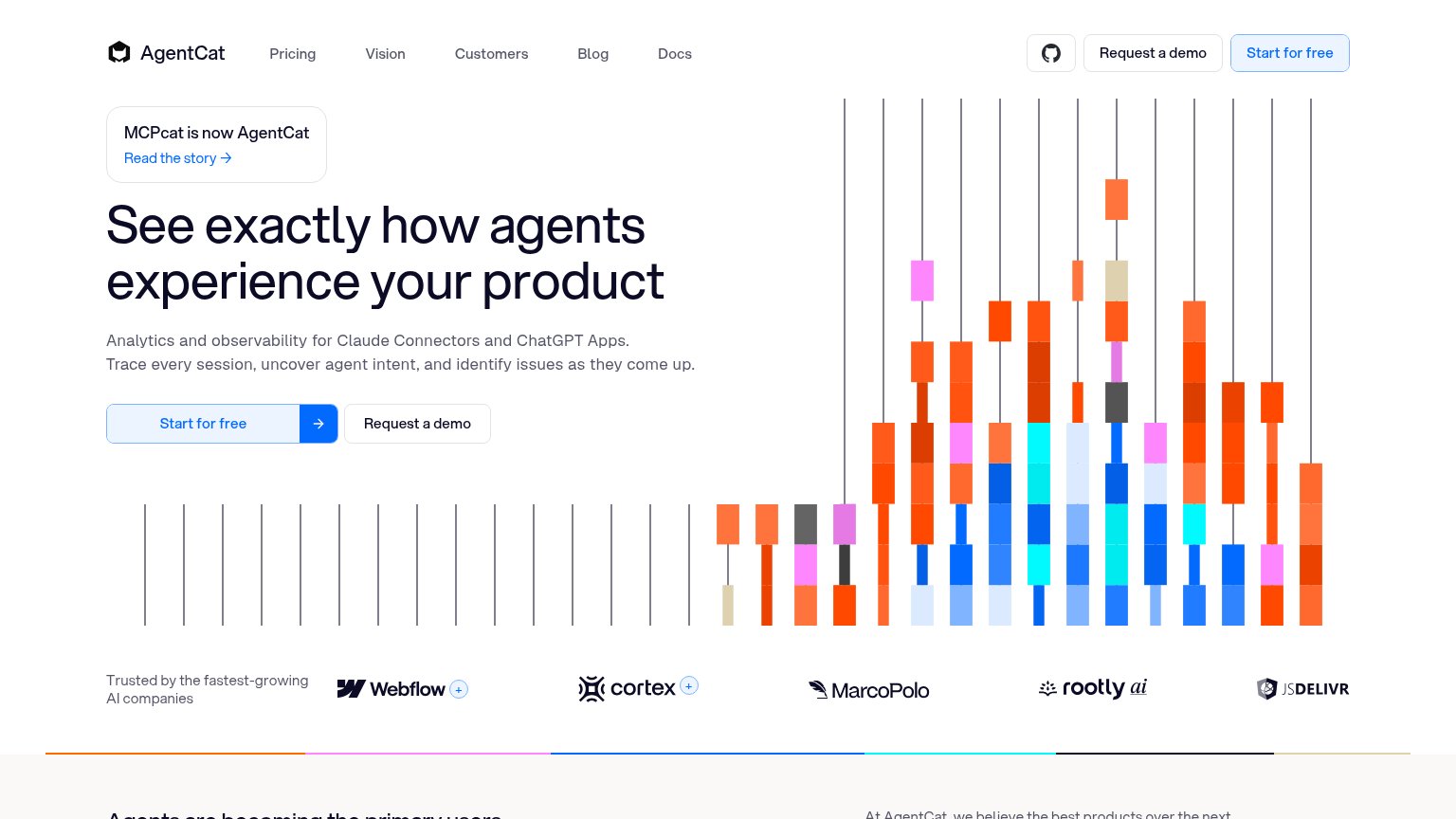
What works
What to improve
Title, subtitle, hero — do they sell the product's true value?
See exactly how agents experience your product
Analytics and observability for Claude Connectors and ChatGPT Apps. Trace every session, uncover agent intent, and identify issues as they come up.
Working
Could improve
Copy, size, verb, cost-feel — does the primary CTA earn the click?
How AgentCat compares
Recommended rewrites
SEO / AEO · agentcat.com
See your search and AI visibility, agent readiness score, and prioritized fixes with Lazyweb Individual.
Start Individual trialYou need a lazyweb account to add your product, do a growth audit, create backlog and more
Sign me in to my Lazyweb report hub. Fetch https://www.lazyweb.com/hub/agent/sign-in.md and follow its instructions exactly. If you can't fetch URLs, tell me and I'll paste the instructions instead.
Lazyweb MCP
Step 1 of 2 · your login
Where should we send your reports? This email becomes your login on lazyweb.com — everything your agent makes lands in your workspace.
That doesn't look like an email — check it and try again.
No password, no spam — one workspace link now, then your agent command.
Step 2 of 2 · your agent
Paste this into your agent. Claude Code, Codex, Cursor, or another MCP-capable agent opens the link and sets itself up. Data access is plan-dependent.
Generating your agent command...